
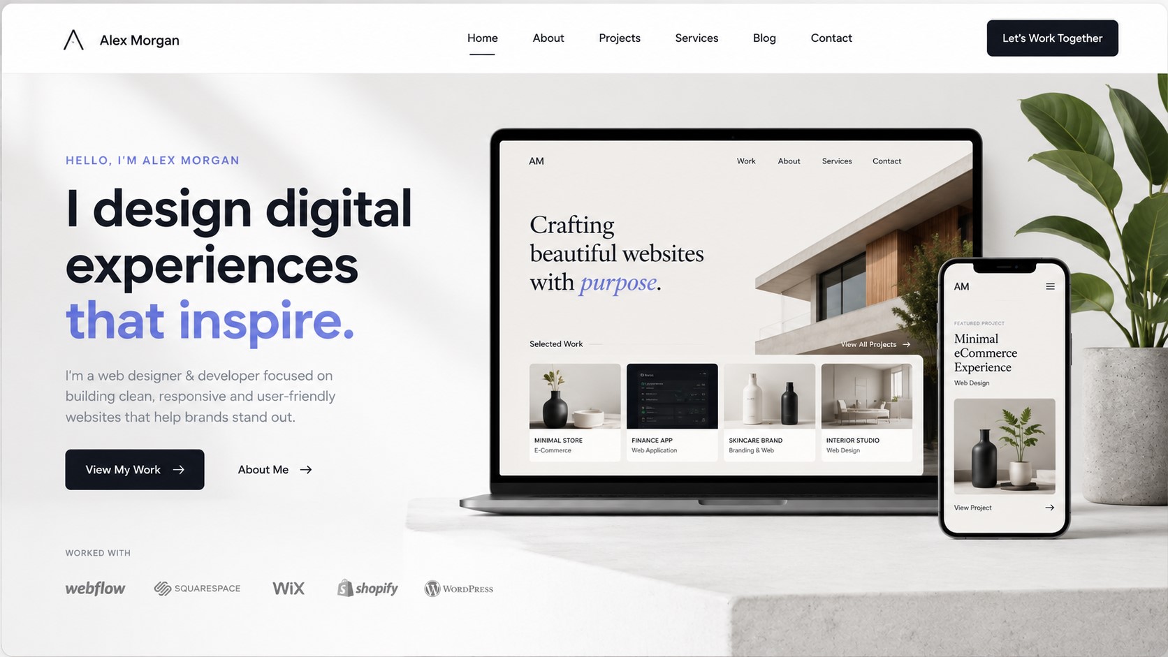
5 Stunning Web Design Portfolio Examples to Inspire Your Next Project
Most people start a website redesign the same way: open a dozen browser tabs, scroll through other people’s portfolios, and hope inspiration shows up. It usually doesn’t. Without a way to judge what you’re actually looking at, you end up either copying a trendy layout that has nothing to do with your brand, or stuck in indecision for weeks while your project sits untouched.
This article breaks down five web design portfolio examples using a simple framework, so you walk away with more than a few screenshots you liked. You’ll know exactly what to point to and what to ask for when you brief a designer or start building your own site.
Contact Us: https://omayikdigital.com/contact-us/
Simple pricing. No surprises: https://omayikdigital.com/pricing-plans/
What Makes a Web Design Portfolio Stunning?
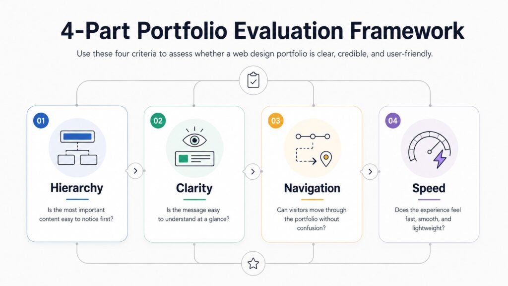
A stunning web design portfolio comes down to four things working together: clear visual hierarchy, a message you understand in seconds, navigation that never makes you think twice, and a page that actually loads fast. Remove any one of these and the rest stop mattering, no matter how good the visuals look.
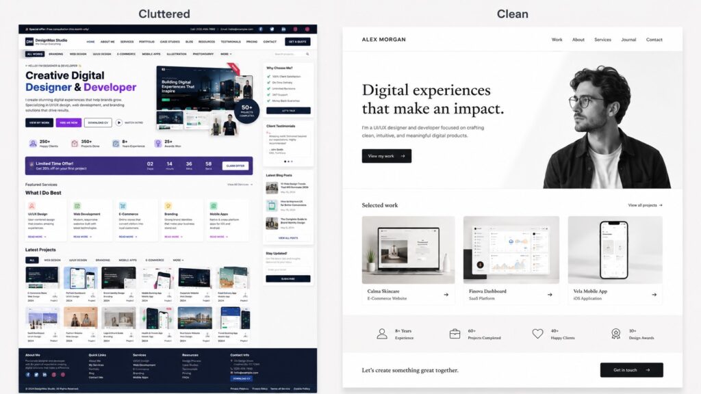
It’s worth separating “stunning” from “busy.” A lot of portfolios mistake density for impressiveness, packing in animations, sliders, and oversized type because it feels more impressive than it actually is. The portfolios that hold up over time are usually the restrained ones. They use one strong idea per section instead of five competing ones.
Here’s the short version of the framework, since you’ll see it applied to each example below:
- Visual hierarchy – does your eye know where to go first, second, and third?
- Message clarity – can a stranger tell what this person or company does within five seconds?
- Navigation – can you find the work, the about page, and the contact info without hunting?
- Performance – does it load fast on a phone with average signal, not just on a designer’s laptop?
Keep these four in mind as you go through the examples. None of them are named, branded sites. They’re archetypes built from patterns that show up again and again in strong portfolio work, across different industries and budgets.
5 Web Design Portfolio Examples Worth Studying
Each of these represents a different way to solve the same problem: convince someone, fast, that you’re good at what you do. None of them get there the same way.
1. The Minimalist Personal Brand Portfolio
Picture a freelance photographer or designer’s site built almost entirely around whitespace. One large image per section. A short line of text. No sidebar, no footer crammed with links, no stock icons filling empty space.
This works because it removes everything that competes with the work itself. When there’s nothing else on the page, the visitor’s attention has nowhere to go except the project in front of them. The risk most people run into when trying to copy this style is confusing “minimal” with “empty.” A minimalist portfolio still needs a clear path through the site. It just gets there with fewer elements, not fewer decisions.
The lesson here isn’t “use more whitespace.” It’s that every section should earn its place. If a sentence or image doesn’t add something the page needs, it’s worth cutting.
2. The Bold, Story-Driven Agency Portfolio
This archetype shows up most often with design or marketing agencies that have a strong voice and want you to feel that voice before you even reach the work. Big type, confident color choices, and project pages structured like short stories: here’s the problem the client had, here’s what we did, here’s what changed.
The reason this format builds trust faster than a plain image grid is simple. A grid of finished screenshots shows you the output. A problem-process-result structure shows you the thinking. Anyone evaluating an agency for a project wants evidence they can solve a similar problem, not just proof they can make something look nice.
The tradeoff is that this style takes more writing and more structure to pull off well. A bold visual identity without a clear narrative underneath it just looks loud.
3. The Interactive Product Designer Portfolio
Some designers, especially in product and UX work, build portfolios that demonstrate skill through the site itself. Subtle hover states. Small animations that respond to scrolling. Embedded prototypes you can actually click through instead of static screenshots.
Done well, this is one of the most convincing formats available, because the portfolio becomes a live example of the designer’s judgment, not just a description of it. Done poorly, it’s also one of the easiest ways to lose a visitor. Heavy animation and embedded interactive elements add weight, and weight slows load time. A product designer’s site that takes six seconds to load on mobile undercuts the entire pitch before a visitor sees a single project.
If you’re considering this route, treat interactivity as something to budget carefully, not something to add everywhere it’s technically possible.
4. The Grid-Based E-Commerce Design Portfolio
This pattern fits designers or agencies with a high volume of past work, often twenty or more projects, where a single-column scroll would take forever to get through. Instead, the homepage opens to a structured grid, frequently with filters by industry, project type, or service.
Structure matters more here because the problem being solved is different. A photographer with eight strong shoots doesn’t need filtering. A design studio with sixty e-commerce builds across a dozen industries does, or visitors will give up scrolling before they find anything relevant to them. The grid format trades some visual drama for usability, and for a portfolio at this scale, that trade is worth making.
5. The Conversion-Focused Freelancer Portfolio
Not every portfolio is meant to be admired. Some are built specifically to generate inquiries, and they’re structured accordingly: a clear one-line pitch above the fold, a short row of testimonials near the top instead of buried at the bottom, and a contact path that takes one click from anywhere on the site.
This archetype sacrifices some of the artistic flourish you’d see in the first two examples in exchange for directness. For a freelancer relying on a steady flow of new client inquiries, that’s usually the right call. A beautiful portfolio that doesn’t make it obvious how to hire you isn’t doing its job, no matter how good the case studies look once someone finds them.
Contact Us: https://omayikdigital.com/contact-us/
Simple pricing. No surprises: https://omayikdigital.com/pricing-plans/
Common Threads Across Every Great Portfolio
Despite covering very different industries and goals, these five examples share more in common than it might first appear:
- Fast load times, even with strong visuals
- A layout that works on mobile first, not as an afterthought
- Consistent typography across every page, not just the homepage
- One clear call to action, not three competing for attention
- Real project outcomes described specifically, instead of vague claims like “great results”
None of these require a massive budget. They require discipline about what stays on the page and what gets cut.
Common Mistakes That Weaken a Design Portfolio
Most portfolio problems trace back to a handful of repeat offenders:
- Cluttered layouts that try to show everything at once instead of guiding the eye
- Image-heavy pages with no compression, which tank load speed on mobile
- Unclear navigation, where finding past work or contact details takes more than two clicks
- No clear call to action, leaving an interested visitor with no obvious next step
- Outdated project examples, including screenshots of client sites that have since been redesigned
- No mobile optimization, even though most portfolio traffic now arrives from a phone
How to Avoid These Mistakes in Your Own Redesign
Before launching or relaunching a portfolio, run through this short checklist:
- Test your homepage load time on mobile, not just desktop
- Confirm every image is compressed without losing visible quality
- Make sure a first-time visitor can find your contact page in two clicks or fewer
- Remove or update any project that no longer reflects your current work
- Check that there’s exactly one primary action you want visitors to take, and that it’s visible without scrolling
Contact Us: https://omayikdigital.com/contact-us/
Simple pricing. No surprises: https://omayikdigital.com/pricing-plans/
How to Apply These Examples to Your Own Website
Inspiration only helps if it turns into a brief someone can actually build from. Once you know which archetype above fits your situation, write down the specifics: which pages you need, what tone the copy should have, how many projects you’re showing, and what your non-negotiables are on load speed and mobile behavior.
This is usually where people either get stuck or overcorrect, either trying to build everything themselves with a generic template or handing over vague instructions like “make it look modern.” Neither tends to end well. If you’d rather skip the trial and error, this is exactly the kind of translation work Omayik Digital LLC handles for clients: taking a rough idea of what you liked about other sites and turning it into a working, branded portfolio built around your actual projects, not someone else’s.
If you’re earlier in the process and specifically thinking about landing pages rather than a full portfolio rebuild, it’s worth looking at landing page design services built around the same principles covered here: clarity, speed, and a layout designed around one outcome.
Key Takeaways
- A stunning portfolio depends on visual hierarchy, message clarity, navigation, and speed working together, not any single design trend
- The five examples above are starting points for a brief, not templates to copy directly
- Quality and structure matter more than the number of projects you show
- Load speed on mobile is non-negotiable, regardless of how strong the visual design is
- The right format depends on your goal: artistic showcase, story-driven trust building, or direct lead generation
FAQs
What makes a web design portfolio stand out from competitors? A standout portfolio combines clear visual hierarchy, fast load times, and a focused message about who it’s for and what problem it solves. The strongest portfolios show real project outcomes rather than just listing services, and they make the next step, like a contact form or inquiry button, obvious within seconds of landing on the homepage.
How many projects should I include in my portfolio? Quality matters more than quantity. Five to eight strong, well-documented projects usually outperform twenty thin ones. Each project should show context, the design decisions made, and the result, rather than a single image with no explanation of the thinking behind it.
Should a portfolio website prioritize design or speed? Both matter, but speed is non-negotiable. A visually striking portfolio that loads slowly will lose visitors before they see the design at all. Compress images, limit heavy animations, and test load times on mobile before treating the visual layer as finished.
Is it better to build a custom portfolio or use a template? Templates can work for early-stage freelancers, but they often limit how distinctly a brand can present itself. A custom-built site allows the layout, interactions, and storytelling to match the specific work being shown, which matters more as a portfolio gets used for higher-stakes client pitches.
How often should a web design portfolio be updated? Most portfolios should be reviewed every six to twelve months. Outdated visual trends, old screenshots of redesigned client sites, or stale case studies can quietly undercut credibility even if the underlying work is still strong.
Conclusion
None of the five examples above are about chasing a trend. They’re proof that the same handful of principles, hierarchy, speed, story, and clarity, show up in good portfolio design no matter the industry or budget behind it. Treat them as a starting point for your own brief, not a template to copy line for line.
If you’ve gone through this and have a clearer sense of which direction fits your work, but aren’t sure how to turn that into an actual site, that’s where Omayik Digital LLC comes in. Reach out to discuss your project and we’ll help you turn it into something that looks as good as it performs.
Contact Us: https://omayikdigital.com/contact-us/
Simple pricing. No surprises: https://omayikdigital.com/pricing-plans/

Leave a Reply