
How to Design an eCommerce Website That Converts Visitors into Buyers
Your online store might be getting traffic, but if visitors aren’t buying, the problem is rarely your product. More often, it’s the design.
A slow page, a confusing menu, a cluttered product listing, or a checkout process that demands too much effort – any one of these can push a ready buyer toward a competitor. The frustrating part is that most of these issues are invisible to store owners who haven’t been trained to spot them.
This guide covers the eCommerce web design best practices that directly influence whether a visitor buys or leaves. You’ll get clear explanations of what works, why it works, and a practical checklist to audit your own store – so you can stop losing sales to preventable design problems.
👉 Simple pricing. No surprises.
Why Web Design Directly Impacts Your Sales
Design is not just about how your store looks. It determines how easy it is to find a product, how much a visitor trusts your brand, and whether they complete a purchase or abandon their cart.
Research from the Baymard Institute consistently shows that cart abandonment rates hover around 70% across industries and a significant portion of that is driven by friction in the user experience, not a change of mind. Visitors don’t always leave because they don’t want your product. They leave because your store made it too hard to buy it.
Good eCommerce web design removes that friction. It builds trust, guides attention, and gets out of the way.
Best Practices for eCommerce Web Design That Maximize Sales
1. Prioritize Mobile-First Design
More than half of global eCommerce traffic comes from mobile devices. If your store was designed primarily for desktop, you are likely losing a significant portion of potential revenue every day.
Mobile-first design means building your store’s layout, navigation, and checkout specifically for smaller screens – then scaling up for desktop, not the other way around. In practice, this means:
- Touch-friendly buttons sized at least 44×44 pixels
- Single-column product layouts that don’t require pinching or horizontal scrolling
- A checkout flow that works smoothly without a keyboard and mouse
- Fast load times, since mobile users on slower connections abandon pages that take more than three seconds to load
Google also uses mobile-first indexing, meaning it primarily uses the mobile version of your site to determine search rankings. A poor mobile experience hurts both your conversions and your visibility.
2. Optimize Site Speed and Performance
Page speed is one of the highest-leverage improvements you can make to an eCommerce store. Slower pages produce higher bounce rates, lower average order values, and reduced conversion rates – across every device type.
Google’s Core Web Vitals – Largest Contentful Paint, Cumulative Layout Shift, and Interaction to Next Paint are the technical benchmarks that measure real-world page experience. These metrics directly influence search rankings.
To improve site speed:
- Compress and properly size all product images before uploading
- Use a content delivery network (CDN) to serve assets from servers closer to your visitors
- Enable browser caching so returning visitors load pages faster
- Eliminate render-blocking scripts that delay how quickly your page becomes usable
- Choose a hosting provider with strong uptime and server response times
Tools like Google PageSpeed Insights and GTmetrix provide free performance audits with specific recommendations.
3. Design for Clear, Intuitive Navigation
If a visitor cannot find what they came for within a few seconds, they will leave. Navigation is how your store guides people from interest to purchase and it is one of the most commonly underestimated design elements.
Effective eCommerce navigation includes:
- A logical category hierarchy — broad categories with clear subcategories, not a flat list of 40 product types
- A prominent search bar — especially important for stores with large catalogues; autocomplete and typo tolerance significantly reduce search failure
- Breadcrumb trails — so visitors always know where they are and can backtrack easily
- A sticky header — keeping the navigation, search bar, and cart icon accessible as the visitor scrolls
Avoid burying important categories inside dropdown menus that require precise mouse control. Test your navigation with someone unfamiliar with your store – if they hesitate, something needs to change.
4. Build Trust with Professional Visual Design
Visitors form a trust judgment about your store within the first few seconds of landing. A dated design, inconsistent branding, or low-quality product images signals risk and most shoppers will not enter their payment details on a site that feels unprofessional.
Trust-building design elements include:
- High-quality product images with multiple angles, zoom capability, and lifestyle context
- A consistent color palette, typography, and visual identity across all pages
- Visible security indicators: SSL padlock, payment method icons (Visa, Mastercard, PayPal, etc.)
- Clear and accessible return, refund, and shipping policies — linked in the footer and near the checkout
- Customer reviews and star ratings displayed prominently on product pages
None of these require an expensive design overhaul. Many can be addressed with targeted improvements to your existing store.
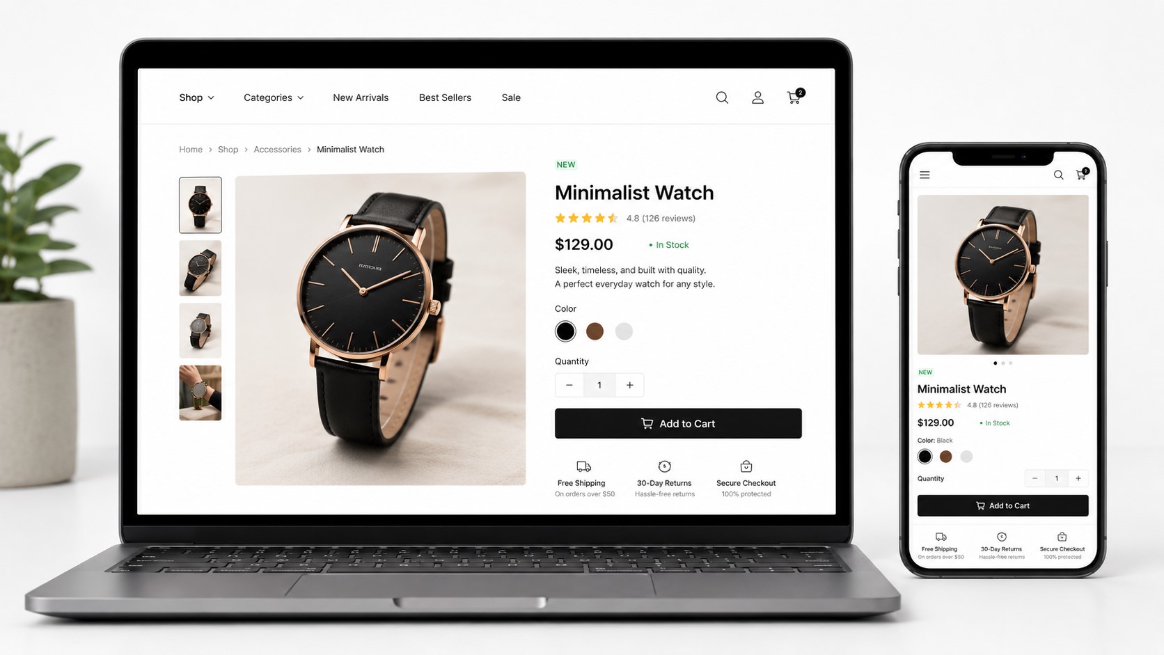
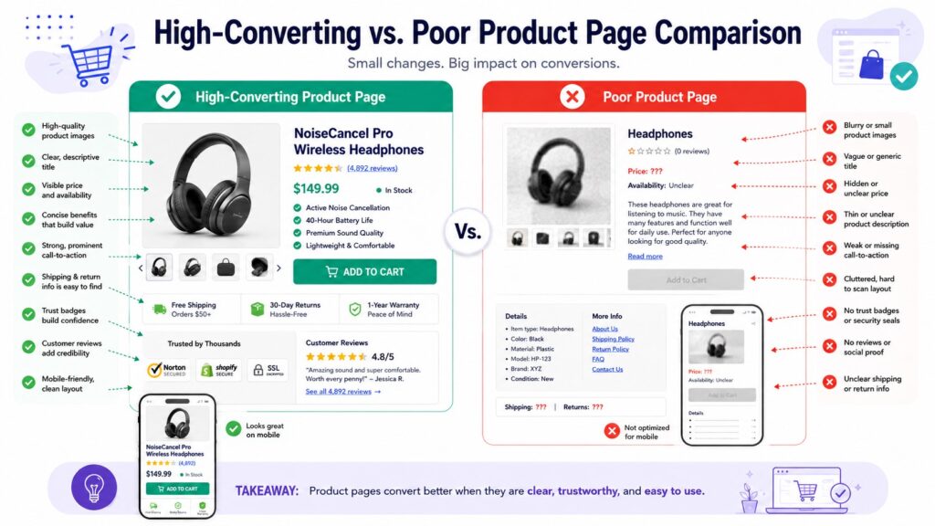
5. Write Product Pages That Sell
Your product page is where purchase decisions are made. A weak product page – one with a vague title, a thin description, a single small photo, and a hard-to-find “Add to Cart” button – loses sales that your marketing spend already paid to generate.
A high-converting product page includes:
- A clear, descriptive product title that matches how your customers actually search
- Benefit-focused descriptions — not just specifications, but what those specifications mean for the buyer
- Multiple product images — front, back, detail shots, and at least one lifestyle image showing the product in use
- A prominent, high-contrast CTA button — “Add to Cart” or “Buy Now” — placed above the fold and repeated below longer descriptions
- Pricing transparency — no hidden fees discovered at checkout
- Stock indicators — “Only 3 left” creates genuine urgency when true; do not fabricate scarcity
- Customer reviews — displayed on the product page, not just a separate reviews tab
For products with variants (sizes, colors, materials), make the selection interface obvious. A visitor who cannot easily find their size will not guess – they will leave.
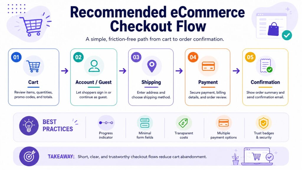
6. Streamline the Checkout Process
Checkout is where the most preventable revenue loss happens. Every additional step, every required account creation, every unexpected fee, and every confusing form field increases the chance that a ready buyer abandons their cart.
Best practices for checkout UX:
- Offer guest checkout — forcing account creation before purchase is one of the top reasons for abandonment
- Minimize form fields — ask only for what is necessary to complete the order
- Show a progress indicator — visitors want to know how many steps remain
- Display an order summary — keep the cart contents, quantities, and total visible throughout checkout
- Offer multiple payment methods — credit/debit cards, PayPal, digital wallets, and buy-now-pay-later options where relevant
- Show total costs early — revealing shipping fees or taxes only at the final step causes significant abandonment
One-page checkout reduces friction for simple orders. Multi-step checkout with clear progress indicators works well for complex or high-value purchases. Test both if your platform allows it.
7. Use Strategic CTAs and Persuasion Elements
A call-to-action button does more than label a function. Its placement, size, color, and copy all influence whether a visitor clicks or scrolls past.
Effective CTA design:
- Use high-contrast colors that stand out from the surrounding page without clashing with your brand
- Write action-oriented copy: “Add to Cart,” “Get Yours Today,” “Choose Your Size” — not just “Submit” or “Click Here”
- Place the primary CTA above the fold on product pages, and repeat it after longer descriptions
- Use urgency and scarcity elements honestly — real low-stock alerts, time-limited promotions with actual end dates
Avoid dark patterns: fake countdown timers, artificially inflated “original prices,” or pre-checked opt-ins. These may produce short-term clicks but erode trust and invite returns and chargebacks.
8. Implement Effective Search and Filtering
For stores with more than a few dozen products, search and filtering are not optional features – they are core to the buying experience.
Visitors who use on-site search convert at significantly higher rates than those who browse. Make sure your search:
- Appears prominently in the header on every page
- Returns relevant results even for partial or misspelled queries
- Includes autocomplete suggestions
- Handles “no results” gracefully — suggest related products rather than showing a dead end
Filtering allows visitors to narrow results by price, size, color, material, category, or rating. Poor filtering forces visitors to scroll through irrelevant products until they give up. Good filtering gets them to what they want in seconds.
9. Design for Accessibility and Inclusivity
An accessible eCommerce store is usable by people with visual, motor, auditory, or cognitive disabilities. Beyond being the right approach, accessibility also improves SEO – many of the technical requirements overlap with what search engines need to understand your content.
Key accessibility practices:
- Sufficient color contrast between text and backgrounds (WCAG recommends a minimum ratio of 4.5:1 for body text)
- Descriptive alt text on all product images
- Keyboard-navigable menus, forms, and checkout flows
- Readable font sizes — 16px minimum for body copy
- Form fields with clear labels (not just placeholder text that disappears when the user clicks)
The Web Content Accessibility Guidelines (WCAG), maintained by the W3C, provide the full technical standard. Many countries are also moving toward legal requirements for digital accessibility.
10. Leverage Social Proof and User-Generated Content
People trust other buyers more than they trust brand messaging. Social proof – in the form of reviews, ratings, photos, and testimonials – reduces the uncertainty that holds visitors back from purchasing.
Where to place social proof:
- Star ratings and review counts near the product title on every product page
- Customer photo galleries showing the product in real-world use
- Aggregate review scores on category pages and the homepage
- Trust badges — “10,000+ happy customers,” “4.8/5 stars across 2,000 reviews” — in the header or near the checkout
Avoid displaying only five-star reviews. A mix of ratings with genuine responses to critical feedback actually increases credibility. Shoppers are suspicious of perfect scores.
Common eCommerce Web Design Mistakes to Avoid
Even well-intentioned stores make design decisions that quietly cost them sales:
- Cluttered homepage — too many promotions, banners, and pop-ups competing for attention; visitors don’t know where to look
- Autoplay video or audio — intrusive and frequently cited as a reason to immediately close a tab
- Excessive pop-ups — one well-timed email capture is reasonable; four overlapping offers within ten seconds is not
- No visible return policy — shoppers check before buying, especially for apparel, electronics, and gifts
- Broken mobile layouts — text that overflows, buttons that overlap, or images that don’t scale
- Slow image carousels — homepage sliders that load heavy images often hurt both speed and usability
- Unhandled 404 errors — broken links to deleted products should redirect to the relevant category, not a dead end
Many of these issues are easy to fix once identified. A structured audit of your store against a design checklist is often the fastest way to surface them.
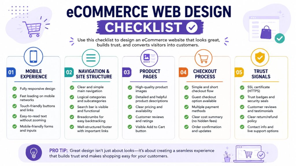
eCommerce Web Design Checklist
Use this checklist to audit your current store or evaluate a new design before launch.
Mobile & Speed
- Store is fully responsive and tested on multiple screen sizes
- Pages load in under three seconds on mobile connections
- Core Web Vitals pass Google’s thresholds
- Images are compressed and correctly sized
- Checkout works smoothly on touchscreen devices
Navigation
- Category structure is logical and no more than three levels deep
- Search bar is visible on all pages
- Breadcrumbs are present on product and category pages
- Header remains accessible while scrolling
Product Pages
- Product titles are clear and search-friendly
- Descriptions focus on benefits, not just specifications
- Multiple high-quality images are present, including lifestyle shots
- CTA button is above the fold and high-contrast
- Pricing, variants, and stock status are clearly shown
- Customer reviews are visible on the page
Checkout
- Guest checkout is available
- Form fields are minimal and clearly labeled
- Progress indicator is shown throughout
- Order summary is visible at every step
- Multiple payment methods are offered
- Shipping costs are shown before the final step
Trust Signals
- SSL certificate is active (padlock visible in browser)
- Payment method icons are displayed
- Return and refund policy is linked and easy to find
- Customer reviews and ratings are displayed prominently
- Contact information is accessible
When to Work with an eCommerce Web Design Agency
Some design improvements – image optimization, button copy, or layout adjustments – can be handled in-house. Others require a more systematic approach.
Consider working with a professional eCommerce web design agency if:
- Your conversion rate has been declining despite consistent traffic
- Your bounce rate is high, particularly on mobile
- Your checkout abandonment rate is above industry benchmarks
- You are launching a new store and want to build on a solid foundation from day one
- Your current store was built on a template that no longer fits your brand or product range
A good agency brings both design expertise and an understanding of conversion behavior – not just aesthetics, but the structural decisions that determine whether a visitor buys.
If your store is struggling with any of the above, a professional design audit is a practical starting point. Omayik Digital works with eCommerce businesses to improve both store design and conversion performance – from targeted UX fixes to full store redesigns.
Key Takeaways
- Mobile-first design is non-negotiable — most eCommerce traffic comes from mobile devices, and a poor mobile experience loses both customers and search rankings.
- Page speed directly affects conversion rate — even small improvements in load time can meaningfully reduce bounce rates.
- Clear navigation helps visitors find products faster, which increases the likelihood of purchase.
- Product pages are where buying decisions are made — weak product pages waste marketing spend.
- A streamlined checkout with guest access, minimal fields, and transparent costs reduces cart abandonment.
- Trust signals — reviews, security indicators, clear policies — address the uncertainty that stops visitors from buying.
- Regular design audits against a structured checklist help surface preventable issues before they drain revenue.
Frequently Asked Questions
What is the most important element of eCommerce web design? There is no single answer, but if one area demands priority, it is the checkout flow. A visitor who reaches checkout has already decided to buy – losing them at that stage is the most costly design failure. Guest checkout, transparent pricing, minimal form fields, and multiple payment options consistently reduce abandonment rates across store types.
How does page speed affect eCommerce sales? Slower pages produce higher bounce rates and lower conversion rates. Mobile shoppers are especially sensitive to load times — pages that take more than three seconds to load lose a significant portion of visitors before they see a single product. Google’s Core Web Vitals are the measurable benchmarks to target, and tools like PageSpeed Insights provide actionable improvement guidance.
How much does professional eCommerce web design cost? Costs vary significantly based on the scope of work, platform, number of products, and agency experience. A targeted UX audit or redesign of key pages costs less than a full custom build. It is worth getting a clear scope of work before comparing quotes — “eCommerce web design” covers a wide range of engagements.
Should I use a website builder or hire a web design agency for my online store? Website builders (Shopify, WooCommerce, Wix) work well for straightforward stores that fit standard templates. An agency becomes worthwhile when your requirements — custom functionality, brand differentiation, conversion optimization, or complex product structures — exceed what templates can deliver efficiently. The choice depends on your store’s complexity and growth ambitions.
How often should an eCommerce website be redesigned? There is no fixed schedule. A redesign is warranted when your conversion rate is declining without an obvious external cause, when your store no longer reflects your brand accurately, when a platform migration becomes necessary, or when significant user experience problems are identified through analytics or customer feedback. Smaller iterative improvements are generally more effective than periodic full redesigns.
Conclusion
Good eCommerce web design is a revenue decision. Every page load, every navigation click, every product description, and every checkout step either moves a visitor toward a purchase or gives them a reason to leave.
The best-performing stores are not necessarily the most elaborate – they are the clearest, the fastest, and the most straightforward to use. They answer the visitor’s questions quickly, display products honestly, and make buying as frictionless as possible.
If your online store isn’t converting the way it should, the issue is often in the design details and those details are fixable. Omayik Digital helps eCommerce businesses identify exactly where visitors are dropping off and what needs to change, from UX audits to full store redesigns. Get in touch to start the conversation.

Leave a Reply