
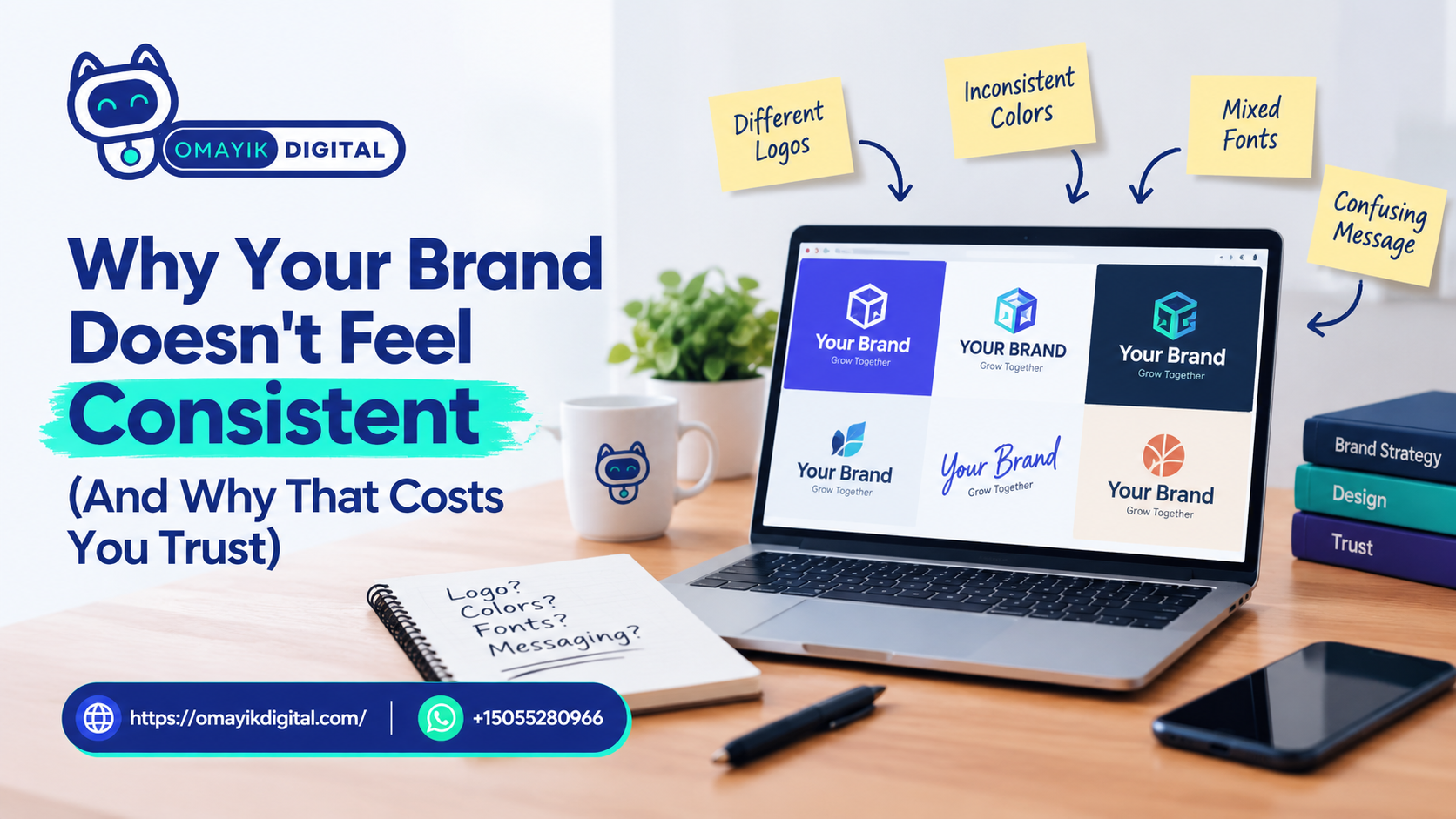
Why Your Brand Doesn’t Feel Consistent (And Why That Costs You Trust)
People don’t trust brands that look different every time they see them.
That’s not an opinion — it’s how human psychology works. When someone finds you on Instagram, visits your website, and gets handed a flyer, and none of them feel like they came from the same place, their brain quietly registers one thing: this doesn’t feel reliable.
You didn’t earn that judgment. But you’ll pay for it every time a potential customer moves on without reaching out.
If you have a logo but your business still doesn’t feel like a brand, this article explains exactly why that gap exists and what a brand style kit actually does to close it.
The Difference Between a Logo and a Brand
A logo is a mark. A brand is an experience.
Your logo is one piece of a much larger system. When it’s the only piece you have, every designer, every template, and every platform you use to represent your business fills in the blanks differently. One post uses your logo colors. The next uses a template you liked. The one after uses a font that felt right at the time.
The result isn’t a brand. It’s a patchwork.
A brand is what people feel when they encounter your business repeatedly. It’s the visual and verbal pattern your audience starts to recognize — and eventually trust. That pattern doesn’t appear by accident. It comes from a defined system.
For small businesses, that system is called a brand style guide or brand style kit.
What a Brand Style Kit Actually Contains
A brand style kit is a short, practical document that defines the rules for how your brand looks and sounds. It’s not a logo file. It’s the instructions for how everything built around that logo should behave.
Here’s what it typically includes:
Your Color Palette
Not just “blue and white” — the exact hex codes, RGB values, or Pantone references your brand uses. A style kit defines:
- Your primary brand color
- Your secondary colors
- Acceptable background and text color combinations
- What colors to never use alongside your brand
Without this, your “brand blue” will be a slightly different shade on every platform and every printed piece. Over time, your audience notices — even if they can’t name what feels off.
Your Typography
Fonts carry more personality than most business owners realize. A bold geometric sans-serif reads as modern and confident. A serif font reads as established and credible. A handwritten script reads as personal and warm.
Your style kit names:
- Your primary headline font
- Your body copy font
- How they’re sized and weighted across different uses
- Acceptable substitutes when your primary fonts aren’t available
When every designer you work with uses the same typefaces, your content starts to feel cohesive even before anyone reads a word.
Your Logo Usage Rules
This covers how your logo can and cannot be applied. Full-color version. White version. Dark background version. Minimum sizes. Clear space requirements. What you should never place your logo on top of.
Without these rules, your logo gets stretched, recolored, placed on clashing backgrounds, or shrunk until it’s illegible. Each of those uses quietly damages the professional impression your brand is trying to make.
Your Brand Voice
Visual consistency matters. Verbal consistency matters just as much.
Your brand voice defines how your business sounds in writing — on your website, in your social captions, in your emails, and in your ads. It answers questions like:
- Do we use formal language or conversational language?
- Do we address the customer as “you” or avoid pronouns entirely?
- Are we warm and encouraging, or direct and results-focused?
- What words or phrases do we avoid?
When your social media reads like one person, your website reads like another, and your ads read like a third, your business feels fragmented — even if the visuals are perfectly on-point.
Imagery and Design Style
Some style kits also define the type of photography, illustration, or iconography that fits the brand. This answers whether your visuals should be bright and airy, moody and editorial, clean and minimal, or bold and graphic. It keeps every image you publish feeling like it came from the same place.
Why Consistency Is a Trust Signal
Here’s the insight most small business owners miss: consistency is a trust signal before it’s ever an aesthetic one.
When your brand looks the same every time someone encounters it, their brain starts building a mental file on your business. They remember you more easily. They recognize you faster. Over time, that recognition builds familiarity — and familiarity builds trust.
This is why established brands invest so heavily in brand standards. McDonald’s golden arches are the same yellow in every country on every surface. Coca-Cola’s red hasn’t meaningfully changed in over a century. Apple’s clean, minimal aesthetic is consistent across every product, ad, and retail space.
These companies aren’t obsessive about consistency because they’re perfectionists. They’re consistent because they understand that inconsistency creates cognitive friction — a subtle sense of “something feels off” that makes people less likely to buy.
Your business operates at a different scale. The psychology is identical.
When a potential customer finds you on social media, checks your website, and receives your proposal — and all three look like they came from the same professional brand — you’ve already started building trust before a single conversation happens.
When they don’t match, you’ve already started losing it.
The Specific Ways Inconsistency Costs Small Businesses
Brand inconsistency rarely causes one dramatic failure. It causes a slow, quiet erosion that’s hard to trace back to a source.
It increases friction in the buying process. When your brand doesn’t feel cohesive, potential customers spend mental energy trying to piece together what your business actually is and does. That friction makes them more likely to keep looking rather than reach out.
It undermines your pricing power. A brand that looks inconsistent or amateur signals to buyers that they can negotiate harder — or that the quality of your work might also be inconsistent. Visual professionalism directly influences what people are willing to pay.
It makes referrals harder. When someone wants to refer a friend to your business, they need to be able to describe you clearly. A business with a fragmented brand is harder to describe and harder to remember.
It slows down your content creation. Without defined guidelines, every new post, flyer, or page requires a new set of decisions. What font? What color? How should this sound? Those decisions eat time that should be spent on the work itself.
It reduces ad performance. Paid advertising works better when your creatives are recognizable. If your ads look nothing like your landing page, your click-through-to-conversion rate suffers because the visual handoff breaks the customer’s confidence.
Common Mistakes Small Businesses Make With Branding
These are patterns that show up regularly — and they’re all fixable.
Using a logo without a style guide. A logo without documented rules is just a symbol. Every person who uses it will make their own decisions about how it should be applied.
Treating every template as a blank canvas. Templates are useful, but using a different one for every piece of content means your visuals have no through-line. Pick one template family and stick to it until you have proper guidelines.
Changing your look every few months. Refreshing your brand visuals too frequently resets the recognition your audience has been building. Consistency compounds over time — disrupting it frequently means starting over repeatedly.
Confusing personal taste with brand strategy. What looks good to you right now and what communicates the right message to your specific customer aren’t always the same thing. A brand system is built around your audience’s trust triggers, not your personal design preferences.
Having a brand guide but not using it. Some businesses commission a brand style guide and then file it away. The guide only has value if it’s shared with every designer, writer, and vendor who touches your brand.
What “Brand and Content That Makes People Stop Scrolling” Actually Means
You’ve probably heard the phrase “stop-scrolling content” before. It usually gets framed as a creative challenge — make something eye-catching enough to interrupt someone’s feed.
But here’s what actually makes people stop: recognition.
When your brand shows up consistently enough that your audience starts recognizing it before they even read the caption, they stop. Not because the graphic is flashy, but because their brain has already built a connection to what your brand represents.
That’s the difference between a brand that creates one great design and a brand that creates a consistent visual system. The single great design gets attention once. The consistent system earns attention every time.
This is what Omayik Digital means when we talk about brand and content that makes people stop scrolling and start trusting you — it’s not about chasing viral moments. It’s about building a visual and verbal presence that compounds over time.
You can see examples of that kind of brand work on the Omayik Digital portfolio.
How to Build a Basic Brand Style Kit
If you’re starting from scratch or working to create structure around an existing logo, here’s a practical starting point.
Step 1: Lock in your core color palette. Choose three to five colors. Define the exact hex codes. Name a primary color, a secondary color, and a neutral. Don’t add more until these are fully documented.
Step 2: Choose two fonts and define how they’re used. One for headlines, one for body copy. Write down the exact names, weights, and sizes for each use case. If they’re Google Fonts, they’re free and widely available.
Step 3: Document your logo variations. Make sure you have your logo in full color, reversed (white on dark), and single color. Write down the minimum size and required clear space for each version.
Step 4: Write three sentences about your brand voice. How do you sound? Who are you talking to? What would you never say? Even a short description helps keep your copy consistent across writers.
Step 5: Collect five to ten reference images that feel right for your brand. Stock photos, real photos, whatever captures the aesthetic you’re going for. This becomes your visual reference when you’re choosing imagery for posts, pages, or ads.
Step 6: Put all of this in one shared document. A PDF, a Google Doc, a Notion page — the format doesn’t matter. What matters is that it’s accessible to everyone who creates content for your business.
If you already have a working website, this process is also a good opportunity to audit whether your web presence matches your brand identity. If you’re noticing the disconnect, it may be time to revisit your web design approach alongside your brand guidelines.
When to Get Professional Help Building Your Brand System
DIY brand guidelines work well in the early stages when you need structure fast. But there are points where professional input creates significantly more value.
Consider working with a branding or creative team when:
- You’re preparing to scale and need guidelines that hold up across multiple channels and team members
- Your current visuals no longer reflect how your business has grown
- You’re running paid ads and your creative assets aren’t converting
- Your business is about to launch a new service, enter a new market, or rebrand
- Customers or prospects have commented that your branding looks outdated or inconsistent
At Omayik Digital, the creatives service is built around exactly this — producing the visual and design foundation that gives your business the kind of professional presence that earns trust before a conversation starts. That includes everything from graphic design to video editing that stays on brand.
If your business also runs digital marketing — whether organic or paid — consistent brand assets directly improve your results. Disconnected visuals between your ads and your landing pages hurt conversion rates, even when the targeting is right.
Key Takeaways
- A logo is not a brand system. A brand system defines colors, fonts, voice, logo usage, and imagery.
- Consistency is a trust signal. It builds recognition and familiarity before a single conversation happens.
- Inconsistency creates friction in the buying process, reduces pricing power, and makes referrals harder.
- A basic brand style kit can be built without significant complexity — the most important step is documenting your choices and sharing them.
- Professional brand work becomes most valuable when you’re scaling, running ads, or when your visuals no longer match your business.
Frequently Asked Questions
What is a brand style guide and why does my small business need one?
A brand style guide is a document that defines the visual and verbal rules for your brand — colors, fonts, logo usage, and voice. Small businesses need one because without it, every piece of content is a fresh set of decisions, and the result is a fragmented look that feels unprofessional to potential customers. Even a simple one-page guide creates meaningful consistency.
How is brand consistency different from just having a nice logo?
A logo is a single mark. Brand consistency means that every touchpoint — your website, social posts, flyers, emails, and ads — looks and sounds like it came from the same business. That repetition is what builds recognition and trust over time, not any single piece of design.
How long does it take to build a brand style guide?
A basic brand style kit can be documented in a few hours if your visual assets already exist. A professionally developed brand system — built from research, strategy, and full visual design — typically takes two to four weeks depending on scope and how many assets need to be created from scratch.
Will brand guidelines help my social media perform better?
Yes, in two ways. First, consistent visuals make your content more recognizable, which increases the chance that your audience stops and engages when they see your posts. Second, if you run paid social ads, brand consistency between your ads and landing pages reduces drop-off and improves conversion rates.
Do I need to redo my logo before building brand guidelines?
Not always. If your logo is solid, guidelines can be built around it. If your logo has problems — it doesn’t scale well, doesn’t work in multiple colors, or doesn’t reflect your current positioning — addressing the logo first makes the guidelines more durable. A quick audit can usually clarify which situation you’re in.
Conclusion
A brand that looks different every time someone encounters it is a brand asking its audience to do extra work. To piece things together. To figure out what you actually stand for. Most people won’t do that work — they’ll move on.
The fix isn’t a rebrand. It’s documentation. Defining your colors, fonts, voice, and visual rules gives every piece of content you create a foundation to build from. Over time, that foundation becomes recognition. And recognition becomes trust.
If you’re not sure whether your brand is sending the right signal, that’s worth finding out before your next campaign, your next client proposal, or your next round of ads.
Not sure if your brand is sending the right signal? We can take a look.
Reach out to the team at Omayik Digital for a brand review, or message us directly on WhatsApp: +1 (505) 528-0966.
Leave a Reply